Giving Data Meaning with Data Storytelling
There's more data out there than ever before, and today's organizations have tools to glean large amounts of it that can lead to great business benefits. But without the right analysis and data storytelling, all of that information can remain a jumbled heap that doesn't translate into any action. Many data analysts who have backgrounds in math or statistics aren't generally accustomed to thinking in terms of stories and narratives. But stories are an essential part of human experience---they engage people in ways that simple numbers don't. And more meaningful engagement leads to better connection and desired changes.
Why Storytelling Matters
Humans have used stories for centuries to make better sense of the world and explore the beauties and challenges of life. On top of that, stories help people remember facts and concepts better. They bring information to life by putting it in a life-like context.

Neuroscientists found that when an audience learned detailed information given straightforwardly, only two areas of their brains were activated---those associated with language processing (called Wernicke's Area and Broca's Area). But when the subjects listened to a story, areas of the brain that process senses and emotion were engaged as well. Other studies have shown that even reading words like "cinnamon" or "lavender" activates the olfactory cortex, descriptions such as "leathery hands" light up the sensory cortex, and so on. When information is put into narrative form, it becomes relevant and real---now it becomes intertwined with people's own experiences, and they care about it more and remember it better.
Levels of Data Presentation
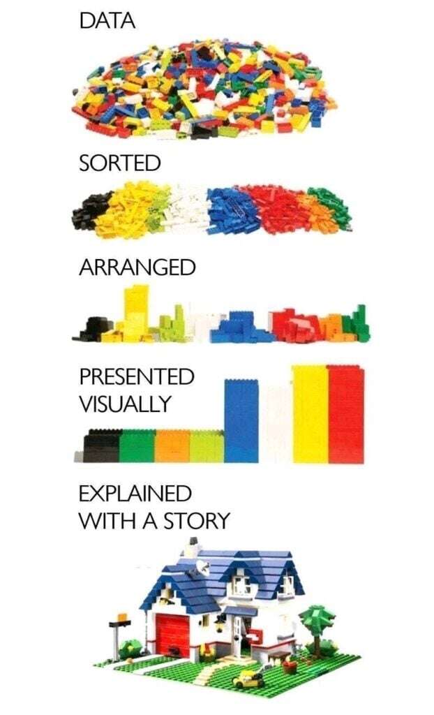
When it comes to data, there are various stages of how it can be managed: with each improving level of organization, greater clarity and impact on the viewer will be achieved. Simply amassing large quantities of data leaves it unfinished and fairly incomprehensible---it's not going to have an impact on someone trying to interpret or understand it. Sorting and arranging it is a good start, and presenting it visually makes for easier understanding and a much stronger impression. If the data is illustrated with a story, then it's truly brought to life and can reach its fullest potential. After all, data isn't gathered just for the heck of it---it's meant to be used to communicate relevance or make insightful change.

Numbers vs. Stories
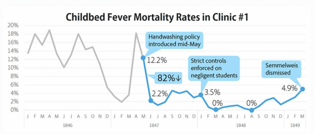
Consider this example. In mid-nineteenth century Vienna, there were high rates of new mothers dying from postpartum infections. In one hospital the doctors’ clinic had an average mortality rate of 9.9%; the midwives’ clinic had a rate of 3.9%. (Today's maternal mortality rate in the United States is around 0.0002%.) The rate at the doctors' clinic reached 12.2% and then, following a change in hospital policy, dropped to 2.2% and eventually 0%. Once the policy was no longer enforced, the rates rose again.

Now, here's the true story behind this data:
Dr. Ignaz Semmelweis, a new assistant at Vienna General Hospital, was shocked and disturbed when his close friend at the clinic died. Before his death, this friend of his had conducted an autopsy and accidentally gotten poked with a scalpel he'd used on a cadaver, developing an infection from the wound. Could that scalpel accident have been what ultimately caused him to die? Dr. Semmelweis drew a connection between his colleague's unfortunate death and those of the maternal patients: doctors regularly performed autopsies and then went on to work with patients afterwards, never washing their hands in between. Midwives didn't wash their hands either, but at least they weren't doing autopsies. So both had high rates of infection and death among their patients, but the doctors' patients had it the worst.

Dr. Semmelweis tried instating a hand-washing policy, and it worked: death rates plummeted. But the culture of the time viewed his theory as an insult to medical practitioners and he was ridiculed. He himself had data to show the correlation between hygiene and lower mortality, but no one paid attention to it. He eventually lost his position at the hospital, was publicly rejected, and wound up in a mental institution. Even the guards there beat him---which led to an infected wound that caused his death.
Which of these accounts will you remember and tell your friend---the percentage comparison or the story of Dr. Semmelweis? Sadly, this intelligent doctor didn't have an effective way to tell his story and save his own life---but telling it today makes important points about medicine, history, and human nature.
When it's Time for Data Storytelling
Data can have important insights latent within it, and storytelling pulls those insights out and plants them in people's heads. There are all kinds of settings where this can provide benefit: in education, internal business teams, reaching out to customers...virtually any communication can potentially be enhanced with a story. It's not always easy to turn those numbers into narratives, though. Data analysis tools like Power BI can help take those streams of information and form them into coherent insights and visualizations, doing much of the initial hard work for you. Once you're able to visually understand the data, connections can be made and stories can begin to emerge---making your information much more compelling to anyone you want to share it with.
Stay connected. Join the Infused Innovations email list!
Share this
You May Also Like
These Related Posts

Detecting a Breach in Real-Time Prevented HIPAA Data Exfiltration

Identify Sensitive Data and Risks in Your Organization with a Compliance Accelerator

No Comments Yet
Let us know what you think