Using Power BI to Analyze COVID-19
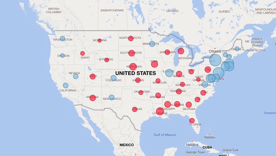
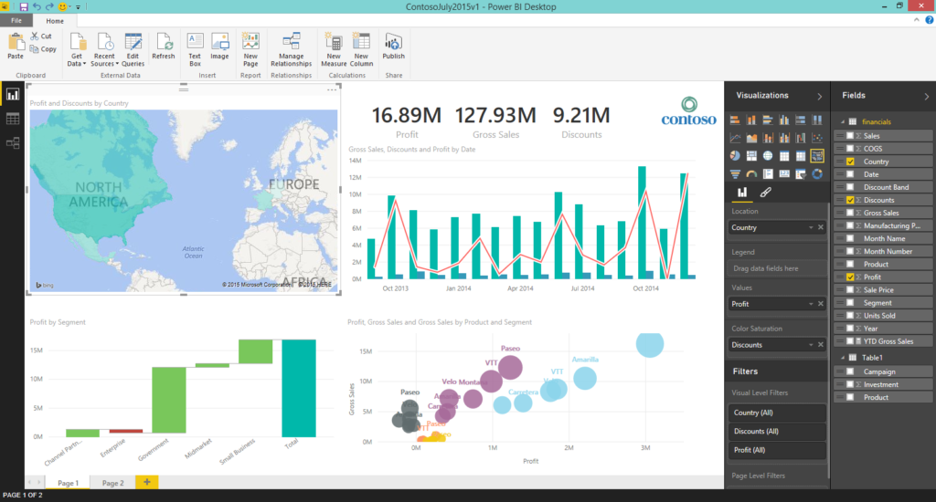
Microsoft's Power BI---short for Business Intelligence---is often used to drive business decisions and strategies through graphs and other interactive visualizations. These applications include forecasting sales, expenses, hiring, etc. In working with Power BI, I've come to realize that while this tool is remarkably helpful, its use tends to be limited to these specialized business spheres. So I thought of applying it to something that nearly everyone in the general population has an interest and concern in: I decided to use Power BI to analyze COVID-19. By creating a Power BI dashboard, I was able to track and analyze pandemic data in the U.S. by state, and through various filters. My goal with this project was to portray a data-driven "story," and to show how Power BI can do this for both business and more general applications.
A Case Example: Rhode Island
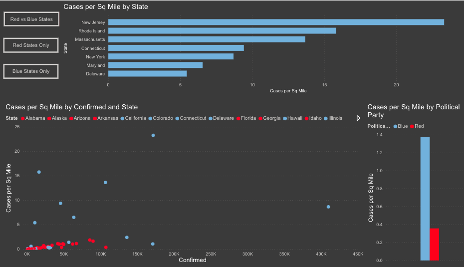
When looking through COVID-19 data websites (like this one I used as my data source), individuals can start to create their own statistics in their heads regarding how the virus is affecting their home states or regions. For instance, I live in Rhode Island. As of June 11th there were roughly 15.8k confirmed cases in the state, which makes it the 29th ranked state for total cases. With just that data, one might be inclined to say, “Wow, Rhode Island is doing a great job.” But Rhode Island is a small state, and if you look at the numbers per capita, you'll see that it has a 1.49% case rate, which is the fourth highest per capita rate in the country. With that additional data point, we can easily see that Rhode Island might not be doing as well as we thought: the story changes quite a bit.
Comparisons by Political Affiliation

Since 2020 is an election year, politics are an interesting factor to investigate as well. According to pandemic data, "blue states" average .88% per capita across the nation, and "red states" are only at .41% per capita. One could easily use these stats to say, “You are twice as likely to contract the virus if you live in a blue state.” Although this seems true enough based on these numbers, there are many other variables that should be considered. The ability to add data points and additional categories in Power BI creates a stronger picture to understand COVID-19's reach more clearly. Once we add these other variables, the story continues to unfold in a more accurate way.
More Data, Clearer Picture

To investigate the matter further, I brought in variables like square miles per state and number of tests given. Now a broader picture was drawn, where the high cases per capita were heavily driven by average population per square mile and number of tests provided. Most of the states with a high number of cases per capita also have some of the highest cases per square mile. So we start to see that many of these “blue” states with higher rates also have much more dense populations. And since higher population density increases human vicinity and interaction, it's most likely this factor---rather than political affiliation or any politically correlated behaviors---that drives the cases up in these regions.
Finally, we can't forget the factor of the testing provided in comparison with population size. To look at Rhode Island again, we see that this state has provided more tests per capita than any other in the country. So in this example, the statement we speculated above---blue states have twice as many cases as red states---becomes akin to President Trump's suggestion that less testing means less cases. The more densely populated states that are providing the most tests per population are yielding the highest reported cases per capita. It isn't rocket science, and yet we fail to see it if we don't factor in these variables. When we add them, we drive the data story in a different and more informed direction. Adding even more data points or variables (such as ethnicity, socio-economic status, age, gender, or other demographics) could paint an even clearer picture of how different areas across the U.S. are being affected by this pandemic.
Power BI: What Story Will You Tell?
Through this example we see how you can tell a story using data, which is what Power BI enables you to do. It is up to you, the end user, to determine what story you want to tell, and how you want to tell it. In strategic business marketing applications---or, perhaps, campaign work---you will want to tell a story to drive a specific point or stance. In broader applications like pandemic tracking, you want to create the most accurate account that you can. The more data points or variables you have, the more accurate your data story will be. Power BI has a lot of great features to help clean or “wrangle” your data sets, and Microsoft also offers many other tools to help bring siloed data together in order to create a 360-degree view of what you are looking at. Some of these tools include (but are not limited to) Azure Data Factory, Databricks, and Dynamics 365 Customer Insights. Leveraging these services and tools can help you tell the data story that will drive your business---or your research---to the next level.

Another interesting way to look at COVID-19 through Power BI could be to take data on remote workers' brain waves and assess the effects that working from home under the pandemic has had on people's brains. Maybe after exploring Power BI and reading our article on EEG findings in remote workers, you'll be inspired to give it a try?
Stay connected. Join the Infused Innovations email list!
Share this
You May Also Like
These Related Posts

Microsoft Expands its Defender for Endpoint to Windows Server 2012 R2 and 2016

How Microsoft Fabric Can Be the Gamechanger in Utilizing Data in Your Business

No Comments Yet
Let us know what you think